If you run a blog you know it is important to keep up with the trends and tech especially when it comes to how people access your content. Most people are browsing the web from their phones now days not just from their desktop computers or laptops.
You might think having a mobile friendly blog is enough to reach these users but that’s no longer the best option.
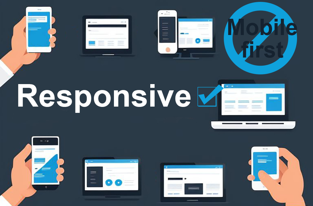
A smarter approach is to create a responsive design adaptable to all devices, not just mobile phones.
Here’s why responsive design is the better choice and how it can make your blog more user-friendly, SEO-friendly, and future-proof despite mobile first approach suggested by SEO experts and Google.
1. The way people browse the web has changed
Mobile usage has skyrocketed since smartphones were introduced. In fact, over 50% of all internet traffic now comes from mobile devices eg. phones and tablets but also wearables like smart watches and A/R glasses. A mobile-friendly design only optimizes your blog for phones which means it might not work well on all the other devices with different screens.
This is where responsive website design comes in. It automatically adjusts your blog’s layout, images and content to fit any screen size. Whether someone is browsing on their 6.7″ phone, 10 inch tablet, 34″ desktop monitor or a massive 65inch 8K smart TV screen your website will always look and function perfectly.
Ads by: ⓘ Random Ads
2. A better user experience, no matter the device
The user experience (UX) is everything when it comes to keeping visitors on your blog. Imagine a visitor land on your blog and starts reading one of your posts on their laptop but later wants to finish it on their phone. If your blog is mobile friendly but not responsive he/she might find the layout different, the text might be hard to read or the navigation is confusing. This inconsistency can frustrate users and make them leave.
With a responsive design, everything stays smooth and consistent. Your blog automatically adjusts to fit the user’s screen, no matter the device. The text will remain readable, the images will resize properly and the layout will stay user-friendly and looks good, always. This seamless experience encourages people to stay on your site longer, explore more of your content and return visiting your site again over and over.
3. Boost your SEO with responsive web design
In 2015, Google started using mobile-friendliness as a factor in their search rankings and since then they’ve taken things even further by moving to mobile first indexing. This means that Google looks at the mobile version of your site first when determining where to rank it. But in real life things are little different.
While a mobile-friendly design is good, it is not as effective for SEO as responsive design. Here’s why: with a mobile-friendly site, you essentially have two versions of your blog – one for desktop and one for mobile. Google has to crawl both versions which takes more time to load complicating things and potentially hurting your rankings.
Responsive design solves the problem by giving you a single version of your website that works on all devices and looks good on different screen sizes. Google prefers this because it is easier to crawl and index. As a bonus responsive sites tend to load faster because of the less code. This is another key factor in SEO rankings.
The faster your site loads the better your chances of ranking higher in search engine results.

4. Save time and money on maintenance
If you go the mobile-friendly route you’ll need to creating two versions of your blog. That means more time and money spent on development and maintenance. Every time you update content, fix a bug or make changes, you have to do it for both versions of your site. With responsive design you do the changes only once.
Responsive design simplifies everything. You only have one version of your blog to manage, which makes updates faster and easier. You’ll save money on development costs and reduce the chances of inconsistencies between the mobile and desktop versions of your blog. In long run a responsive design will make your life a lot easier.
5. Higher conversion rates
One of the most important goals for any website is to convert visitors into subscribers, customers or followers. The layout and design of your website plays a huge role in achieving this. If visitors can’t navigate easily through your site or find what they’re looking for they’re less likely to take any action.
Ads by: ⓘ Random Ads
Responsive design improves the overall functionality of your blog, which can directly impact your conversion rates. Whether someone is filling out a contact form, signing up for a newsletter, or clicking on a call-to-action button, a responsive site makes it easy for them to do so—no matter what device they’re using. If your blog is intuitive and easy to navigate, visitors are more likely to engage with your content and complete the actions that matter to you.
6. Stay ahead of future technologies
Technology is always evolving. New devices and screen sizes are constantly being introduced and if your design isn’t built to adapt, you could quickly fall behind and loose a lot of potential visitors. A mobile-friendly design may work for phones today, but what about new devices in the future?
Flip and fold phones are already here
I’ve seen even a device with threefold screen last week!
Responsive design is more flexible and future-proof. It automatically adjusts to fit any screen size, so as new devices come out, your blog will still look and perform well. You won’t need to redesign your site every time there’s a new phone or tablet on the market, which can save you time and money in the long run.
7. Consistent brand identity
Your website is part of your brand and consistency is key when it comes to building trust with your audience. If your site looks one way on a desktop and completely different on a phone it can confuse visitors and weaken your brand identity.
With responsive web design, your website or blog will have a consistent look and feel across all devices. This means your colors, fonts and overall layout will stay the same whether someone is viewing your blog on a desktop, tablet, or smartphone. A cohesive brand experience builds trust with your audience and makes your blog more memorable.
Conclusion
In a world where people are browsing the web from countless devices, having a responsive website design is essential. Unlike mobile-friendly designs, which only cater to phones, responsive design works on all devices giving your readers the best experience possible. It’s better for SEO, faster, improves user experience, boosts conversion rates and is easier to maintain. Plus, it future-proofs your blog for whatever new technology (and screen sizes) come next. If you want your website to stand out and thrive, responsive website design is the way to go.